“How important is the design of my exhibit in terms of drawing traffic into my booth”
This is a question asked by a vast majority of marketing directors and /or sales managers; the key decision-making executives of companies tasked with presenting their companies’ image and products at upcoming shows to promote their brand in the quest of achieving greater sales and market penetration. It is both a great question and a dumb question. The design of the booth is extremely important, but perhaps not in the ways they believe it to be.
The focal point in maximizing the value of your trade show design is creating an environment that reflects the values of your company in your customer’s eyes. If you were to write a list of the positive things about your company, how do you convey to your customers that you are the epitome of those positive characteristics?
In my travels, I have seen both extremes, quite frequently, in fact, of companies that clearly spent too much or too little on presenting their image and product at a particular show, as well as the right amount but improperly allocated; bad choices
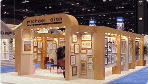
Having a booth that screams ‘Cheap Cheap Cheap’ indicates, to me, that this company was either born yesterday and/or will be gone tomorrow. It also conveys a belief that the show is not important, and possibly that trade show exhibiting, in general, is not something they believe will benefit them but they’re been peer pressured into at least ‘making an appearance’. If I were (and I have been) a buyer tasked with finding the best products and sales arrangements for my store, hospital, my business or even my personal use, I would be offended by companies that clearly look like they don’t want to be there. The unsightly, poorly designed and poorly conceived ‘display’ would tell me that this company doesn’t ‘get it’, and if they don’t get that, how will they ‘get’ what I want or need for the product and sales arrangement I need to help my company grow or provide me satisfaction as a consumer.
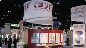
Now, on the other end of the budget spectrum but a ‘fail’ nonetheless, is the company that presents a physical specimen of grandiosity that still fails to ‘connect the dots’ in the buyer’s mind in conveying what this company and its products are about, and more importantly, why this buyer should do business with them vs someone else. Strewn about convention floors across the globe are exhibit designs that are completely out of touch with the products and image that define the companies themselves. High arching canopies and flashing lights zig-zagging this way and that, completely divorced from the company’s logo and imaging presentation and /or the positive characteristics & value of the product.
In this age of technology, the urge is to take the term ‘get the most bang for your buck’ too literally, as well as the term ‘catching their eyes’. Hi-tech lighting and gadgets can often be distracting from the message your company is trying to present about the value of the company to the exhibitor, and the way in which their company and their product is different and better than their competitors.
However, with the right product mix and company image, going hi-tech can be of great benefit to capture the imagination of a buyer. You don’t want to just ‘catch the eye’, you want to generate a ‘whoa’ from potential buyers, to generate a thought in their minds that you are the wave of the future and they need to hop on that ride now before it leaves them behind. You also want them to know that you’ve been providing that service for the duration of your company’s existence and that you’ll be here in another 50 years offering the best product and service in your business.
How do you portray longevity without looking old or ‘has-been’, while conveying innovation without seeming ‘flash-in-the-pan’? It comes down to truly understanding your market niche and creating an environment in your exhibit that resonates with the values your image and product project.
The greatest benefit to the new technology in exhibiting is making ‘awesome’ affordable. LED lighting is very affordable as are flat-screen monitors, tablet computers and dozens of lightweight materials which can customized to shape and design while maintaining an overall lightweight exhibit that lowers your material handling (drayage) rate, probably the most expensive aspect of bringing in an exhibit after the exhibit space cost itself.
In our next blog, I will be going through some of the different materials being used these days to maximize your visual effect while limiting your exhibiting budget.


Comments are closed.